LaserWarn Dashboard & Management Console
This was a project I did with Block Engineering, a company that specializes in high-end laser products including an award winning product called LaserWarn. LaserWarn shoots a special quantum cascading laser at a mirror and then based on how the laser looks when it is bounced back, it can detect in real time what kind of chemicals and gasses are in the air in its path. Pretty amazing stuff.
The problem was that while they had an excellent hardware product, the user interface left something to be desired. It was functional but somewhat ad hoc looking, confusingly laid out and lacked a polished, finished-product feel. Scientists didn’t seem to care much about the aesthetics of the UI, but other customers with less of a grasp of the hardware’s technology would focus on the appearance of the front end and develop a negative perception of the product as a result.
User Stories
The development team had already determined that the new UX should have three different user stories:
An operator view, with a limited set of information and control.
A more in depth supervisor management console, that would give a higher level of detail and allow for the adjustment of some of the device’s settings.
An administrator version of the management console, which was an extension of the supervisor management console, with additional functionality.
Each would be a successively expanding level of system access and privilege.
Visual Design
In discussions with the business owners, engineers and other stakeholders, we decided the UI should have a very clean, minimal look for maximum intuitiveness and to avoid any chance of confusion in a real-world scenario. This also intersected well with the approach of current industry leading UI aesthetics which has moved towards a very flat, minimalist style in recent years, emphasizing content over styling.
We also decided on a “dark-mode” color scheme, both because it is au courant and also more practically because it would be easier on the eyes both in a darkened security office as well as in outdoor situations.
Prototype
A clickable prototype is available here, created using Adobe XD. It includes break-outs of some of the components as separate pieces for more detailed prototyping, a style-guide / asset sheet of downloadable SVG graphics for developer use, a sample grid for the mosaic layout (and for mobile if they choose to develop a responsive web app), and their logo which I recreated vector versions of for them.
Operator Dashboard
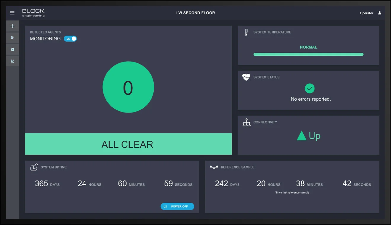
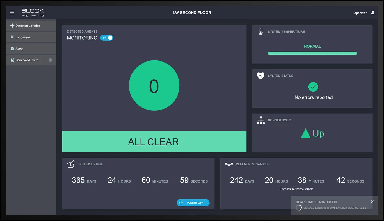
The operator UI was designed to be like a dashboard, intended for passive monitoring. We envisioned the operator UI as possibly being displayed both on an actual security personnel’s monitor as well as being displayed on a large monitor in more of a digital signage situation. As such we made an effort to contain its contents to a single screen’s worth of height.
We decided to use a collection of group boxes reminiscent of Google’s Material Design cards or Microsoft’s Fluent Design System tiles, laid out mosaic style, for the various pieces of information relevant to the operator. This choice allowed for the presentation of various monitored functions in a visually easy to digest manner, and also allowed for ease of future extensibility - if we decided another function needed to be monitored, we could simply add another card and rearrange the mosaic without significantly impacting the underlying design.
We also grouped some additional functionality that wasn’t part of monitoring in a collapsable sidebar menu. This logically separated the monitoring related functions from other non-monitoring related functions. It also got them out of the way if the screen was to be used as more of a digital sign.
We determined that the operator view needed some continually ongoing movement to indicate that monitoring was up and working, so we decided that the monitoring of agents - which was the most important item on the dashboard - should be presented in a large tile as a sort of heartbeat, pulsing in a simulated synchronization with the laser’s scans. We also added some counters for the system up-time and the last time the system was calibrated, with the ticking of the seconds as another indicator that the system was alive and functioning.
Supervisor Management Console
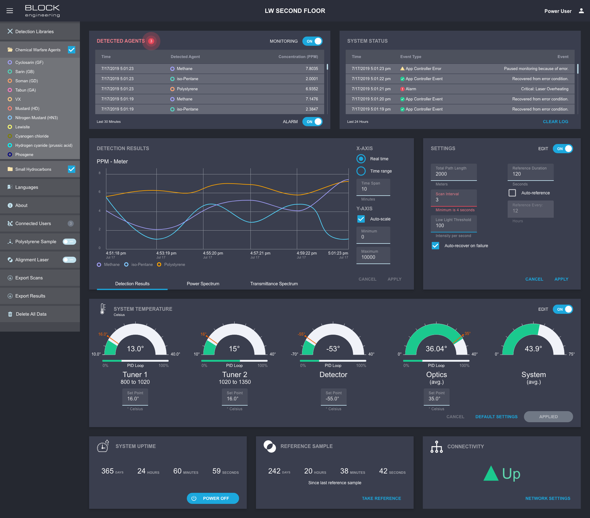
The supervisor view still employed the card/tiles motif of the operator view, but contained a much higher level detail and functionality, both within the cards and in the sidebar menu. For example, whereas the operator is given a simple binary amount of information - either everything is fine or everything is NOT fine, as represented by the “heartbeat” card - the supervisor is given detail about exactly which chemicals and in what amounts they were detected by way of a running time-stamped list and a plotted graph.
Administrator Management Console
The administrator view is essentially the same as the supervisor view, except with the addition of access to some additional system settings, primarily the ability to adjust certain temperature thresholds within the system.
Assets For Development
As part of packaging up the design, I created an asset sheet / style guide from which developers could download vector imagery used in the design as well as get color values. I also provided some additional detail about empty states, tool tips, and a layout grid. As a finishing touch I recreated their logo for them as a vector graphic, as they didn’t seem to have vector version available.


