USAA Insurance Web App
This was a project to redesign the insurance quoting web app for USAA, one of the nation’s larger insurance companies. There were multiple pieces to this project and multiple designers collaborating on it, all of us trying to keep the various pieces in sync and sharing asset libraries.
The multiple pieces included quotes for two types of insurance - Umbrella and Valuable Personal Property. Each type of insurance had two distinct user flows, one for new policies and one for adding coverage to an existing policy. Finally, there was both a “Member” (customer) facing desktop and mobile experience as well as a desktop-only “Member Service Representative” (employee) facing experience that had some specific requirements around its sizing. It had to fit in a particular width for the terminals used by the employees, who generally had multiple windows open on their screen at once.
My piece of the project was primarily the visual design of the employee facing desktop experience, participating in the creation of patterns and grooming of the shared asset libraries, and some final polish on the customer facing designs for the Umbrella quoting.
User flows and wireframes had already been completed when I joined the project, but there was a gap between the wireframes and the desired final visual design. The wireframes had failed to take into account the sizing requirements for the employees’ terminals, and while the user flow was locked down, the layout and design had evolved somewhat from the wireframes. As such, the final visual design involved some rethinking of the layout to accommodate the employee size requirements, changes to user input methods, and the creation or adjustment of quite a few UI patterns as shared assets.
The work was done in Sketch, and a sample of the project file can be seen here.
User Flow
Below are the user flows for the employee experience for the Valuable Personal Property quotes, with a unique flow for new policies (“acquisition”) and adding to an existing policy (“services”). The user flow had already been designed and approved when I joined the project, so I didn’t create these. They were simply a reference for me as I worked on the visual design.


Wireframes
Here are the wireframes that were intended to reflect the user flow. These were a reference and starting point for the final visual design, but the layout needed to change somewhat to accommodate a specific narrower screen width, and the UI patterns and branding we established are not represented here.


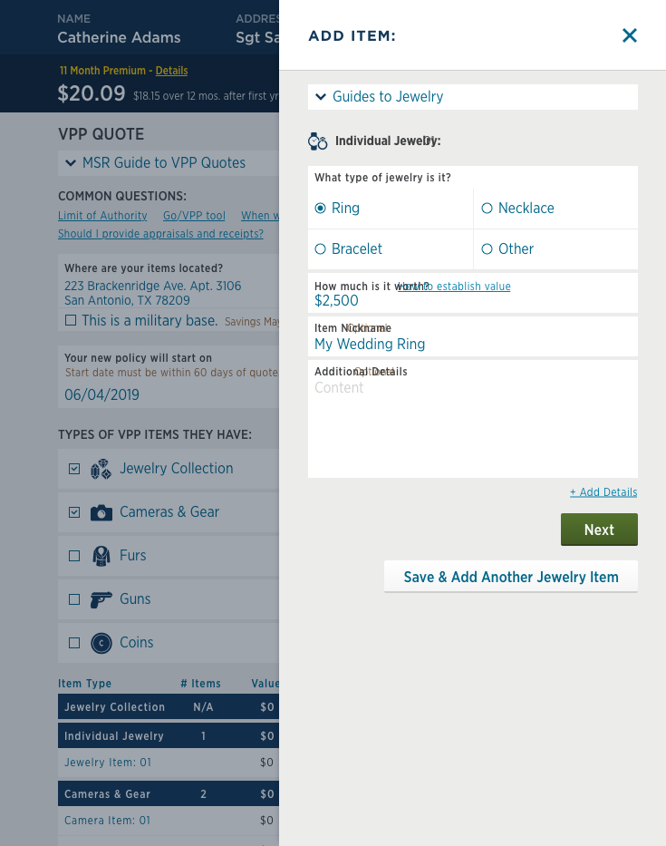
Visual Design
The final visual design with more styling to the UI components and patterns. It is also at the required screen width.


Annotations
As part of finishing the design phase, we marked up the visual design with annotations about expected behavior. The call-outs in blue mark every hit area and the call-outs in green describe the expected behavior if it was not self-evident.


